Blog / Understanding Colour Psychology in Interior Design in 2025
Tuesday, 19 Apr 2022
Understanding Colour Psychology in Interior Design in 2025
Introduction:
Colour psychology is a crucial aspect of interior design that influences the mood and ambiance of a space. While often discussed in branding and marketing, the strategic use of colour in interior design can have a profound impact on the emotional atmosphere of a room. Understanding how different colours affect emotions can help you create environments that align with your desired mood and functionality. This knowledge is a key component of any comprehensive interior design course.

The Power of Colour in Interior Design:
Colours can evoke a range of emotions—from joy and serenity to tension and sadness. Despite its significant impact, many people overlook the psychological effects of colour when designing their homes or workplaces. Selecting the right hues is essential to crafting an atmosphere that enhances well-being and meets your design goals. This highlights the importance of interior design in shaping our daily environments.
The Importance of Interior Design and Decoration in 2025:
The importance of interior decoration 2025 extends beyond aesthetics. It influences how we experience and interact with our environments. By applying principles of colour psychology, you can enhance the functionality and emotional impact of a space, demonstrating the crucial role of interior design in improving our daily lives.
Key Colours and Their Psychological Effects
1. Blue Colour Psychology in Interior Design
Blue is known for its calming and stabilizing effects. It symbolizes trust, dependability, and inner peace.
According to blue color psychology in interior design, soft blues (like powder blue or sky blue) are perfect for spaces that require mental clarity and emotional rest—like bedrooms, meditation zones, or spas. On the other hand, darker tones like navy or midnight blue add a sense of structure, authority, and formality, making them suitable for home libraries or sophisticated dining areas.
Tip: Pair blue with whites, beiges, or warm metallics to avoid a cold or overly clinical look.
2. Green Colour Psychology Interior Design
Rooted in the natural world, green brings a sense of balance, harmony, and restoration.
In green colour psychology interior design, this hue is considered the most restful colour for the human eye. Soft sage or olive green promotes tranquility and is ideal for bedrooms, therapy rooms, or study areas. Rich shades like forest or emerald green introduce opulence while maintaining a grounded, organic feel—perfect for feature walls or luxurious living spaces.
Tip: Combine green with wood textures and natural light to amplify its calming, biophilic impact.
3. Black Color Psychology in Interior Design
Powerful, mysterious, and bold, black introduces drama and depth to a space.
Black color psychology in interior design associates the colour with authority, luxury, and elegance. While black can be stunning when used as a focal point—such as in cabinetry, frames, or fixtures—excessive use can shrink a space or feel overwhelming. That’s why black works best as an accent or grounding tone, balanced with lighter colours and good lighting.
Tip: Use matte black for a modern aesthetic or high-gloss black for a classic, luxe finish
4. Brown Color Psychology in Interior Design
Warm and earthy, brown evokes comfort, security, and reliability.
According to brown color psychology in interior design, brown creates a welcoming and safe environment. Found naturally in wood, rattan, leather, and stone, it’s often used to add a grounded, timeless charm to interiors. Brown works beautifully in living rooms, dens, or rustic-themed spaces, offering an organic contrast to cooler hues.
Tip: Layer different brown tones (caramel, mocha, espresso) for a cozy, textured effect.
5. White Color Psychology in Interior Design
Symbolizing purity, clarity, and freshness, white is a staple in modern and minimalist interiors.
White color psychology in interior design associates the colour with openness and simplicity. It can make smaller spaces feel bigger and brighter, and when paired with textures (like linen, marble, or wood), it avoids feeling sterile. White provides the perfect neutral backdrop to let other design elements—art, furniture, or accent colours—shine.
Tip: Use off-whites or warm whites for more inviting spaces, especially in homes.
6. Grey Color Psychology in Interior Design
A modern neutral, grey is elegant, timeless, and highly versatile.
Grey color psychology in interior design connects the colour with professionalism, calm, and balance. Depending on the undertone, grey can feel warm or cool. Light greys are popular in contemporary spaces, offering subtle sophistication. Darker greys, like charcoal or graphite, add a moody, intimate atmosphere to bedrooms or lounges.
Tip: Balance grey with pops of colour like mustard yellow, blush pink, or teal to avoid a flat look.
7. Purple Color Psychology in Interior Design
Elegant, imaginative, and spiritual, purple has long been associated with royalty, creativity, and luxury.
In color psychology for interior design, purple stimulates imagination and introspection. Lighter purples like lavender bring a soft, dreamy charm, making them ideal for bedrooms, reading corners, or wellness spaces. Deeper shades like plum or eggplant add richness and drama—often used in lounge areas, creative studios, or boutique-style interiors.
Tip: Mix purple with metallics like gold or brass to elevate its regal appeal, or pair with neutrals to ground its intensity.
8. Yellow Color Psychology in Interior Design
Cheerful, bright, and full of optimism, yellow radiates warmth and positivity.
Yellow color psychology in interior design links the hue to creativity, communication, and mental clarity. Soft buttery yellows create cozy and welcoming spaces, while vibrant shades like lemon or mustard inject energy and boldness. It’s an excellent choice for kitchens, playrooms, entryways, or creative workspaces.
Tip: Use yellow as an accent to brighten dull areas—like a yellow backsplash, chair, or wall art—without overpowering the room.
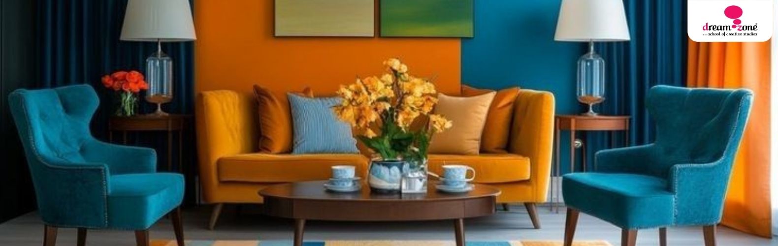
9. Orange Color Psychology in Interior Design
Energetic and sociable, orange blends the passion of red with the cheer of yellow.
According to colour psychology for interior design, orange encourages enthusiasm, appetite, and interaction. This makes it a great fit for social areas such as dining rooms, home gyms, or entertainment zones. Softer shades like peach or coral offer a more subdued version of its lively character, perfect for cozy yet upbeat interiors.
Tip: Use orange to bring warmth to cooler palettes or create a focal point in neutral-themed rooms.
10. Pink Color Psychology in Interior Design
Soft, nurturing, and playful, pink has evolved beyond traditional femininity to become a versatile, expressive interior colour.
Pink color psychology in interior design ties the shade to affection, warmth, and emotional healing. Pale pinks and blush tones evoke calm and gentleness—ideal for bedrooms, nurseries, or dressing areas. Bolder pinks like fuchsia or rose can bring energy and sophistication when used in moderation.
Tip: Combine pink with greys, whites, or muted greens for a balanced, modern look.
Applying Colour Psychology in Interior Design:
Understanding colour psychology allows you to tailor your design choices to create specific emotional responses. Whether you’re designing a calming bedroom or a lively workspace, the right colours can significantly impact how people feel and interact within a space. This knowledge is especially valuable for those pursuing a master diploma in interior design, where mastering the nuances of colour psychology is essential.
Conclusion:
Colour psychology is a powerful interior design tool, influencing mood and ambiance more profoundly than many realize. By carefully selecting colours based on their psychological effects, you can craft environments that not only look beautiful but also enhance the overall experience and well-being of those who inhabit them. Mastery of these concepts is a fundamental part of any interior design education and demonstrates the significant impact of thoughtful interior design on our surroundings.
Images by Michael Td Roberts ?? from Pinterest
Frequently Asked Questions


Corporate Headquarters
No. 25, Dr. Radhakrishnan Salai, Mylapore,
Chennai - 600 004, Tamil Nadu, India.
+91 98843 85048
Flagship Events
Trending Courses
Fashion Design
Interior Design


